Golden Hour
logo • menu design • Illustration • book making
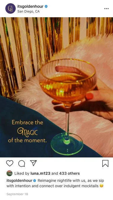
A non-alcoholic speakeasy that reimagines nightlife.
Completed
Spring 2024
Personality
Sophisticated
Intimate
Contemporary
Brand Tool Kit
Neue Kabel
Argaka Fashion
Lubaline

Objective
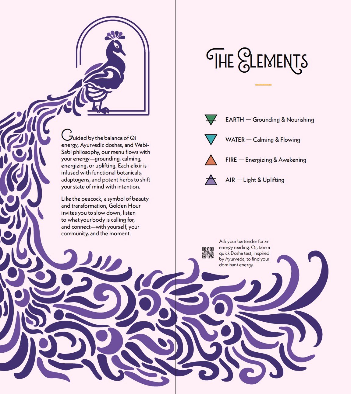
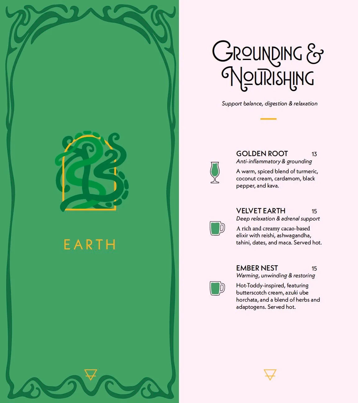
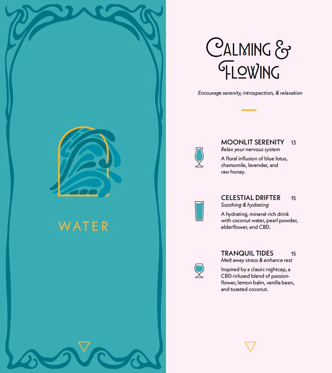
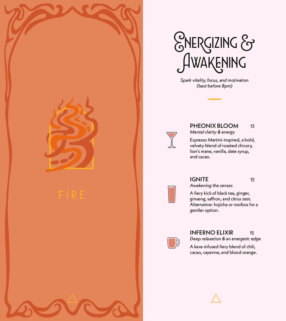
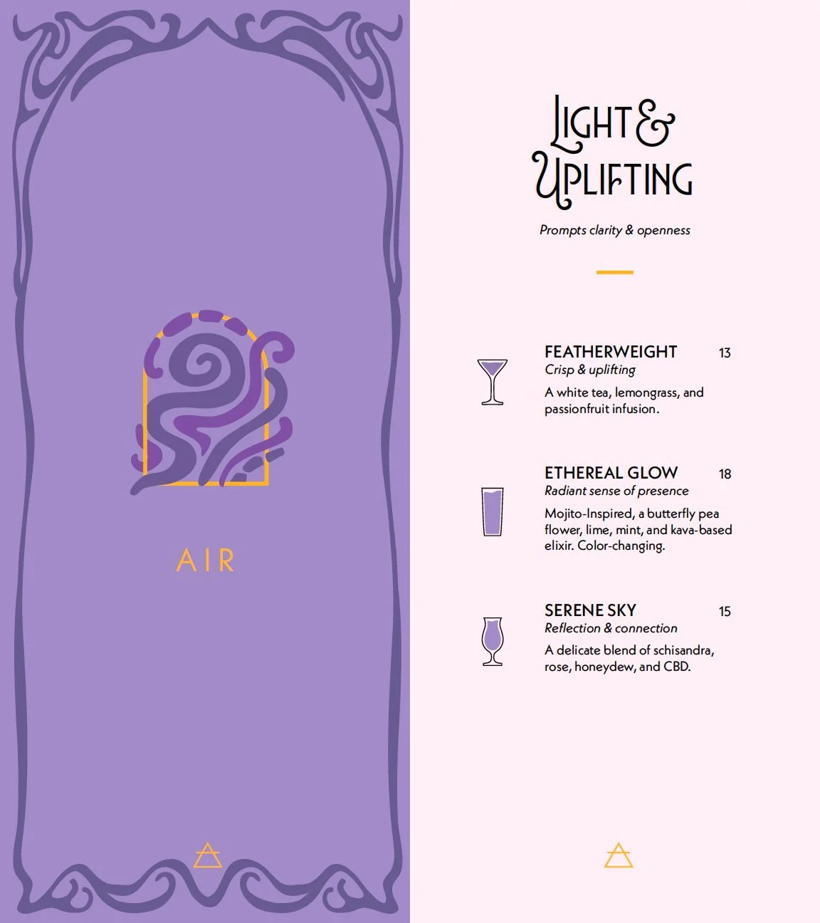
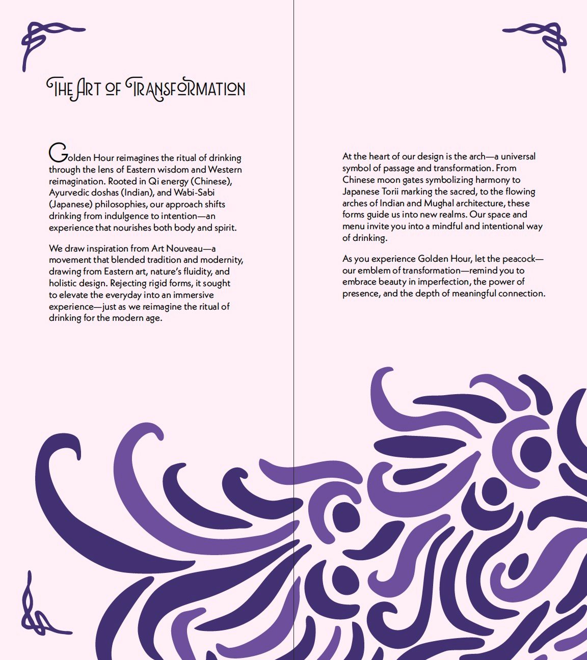
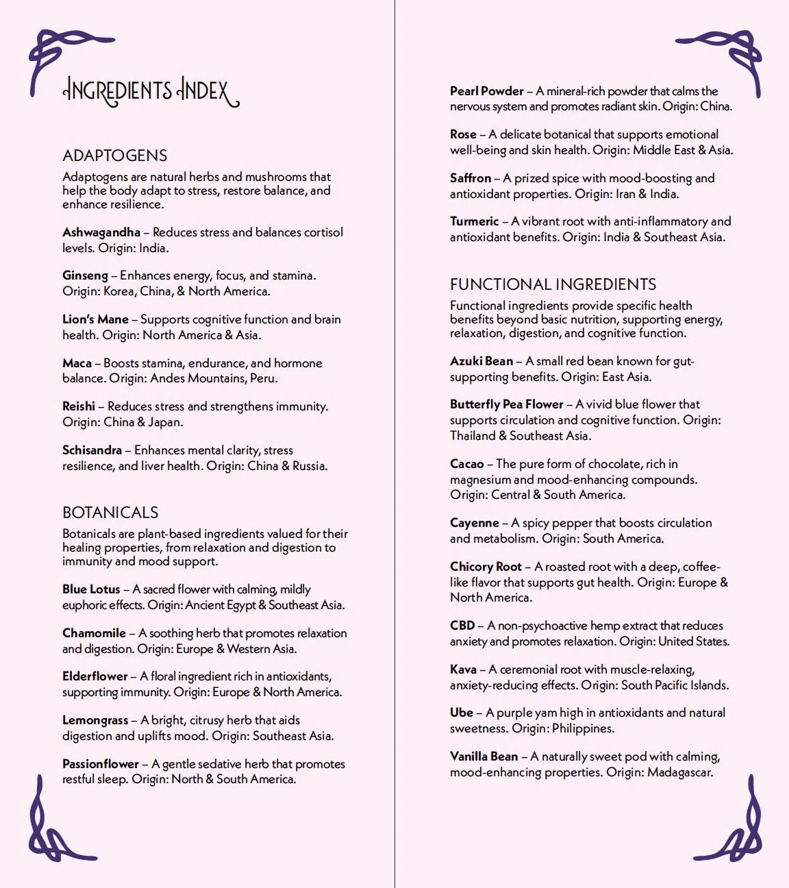
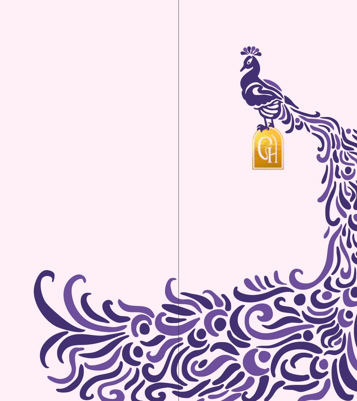
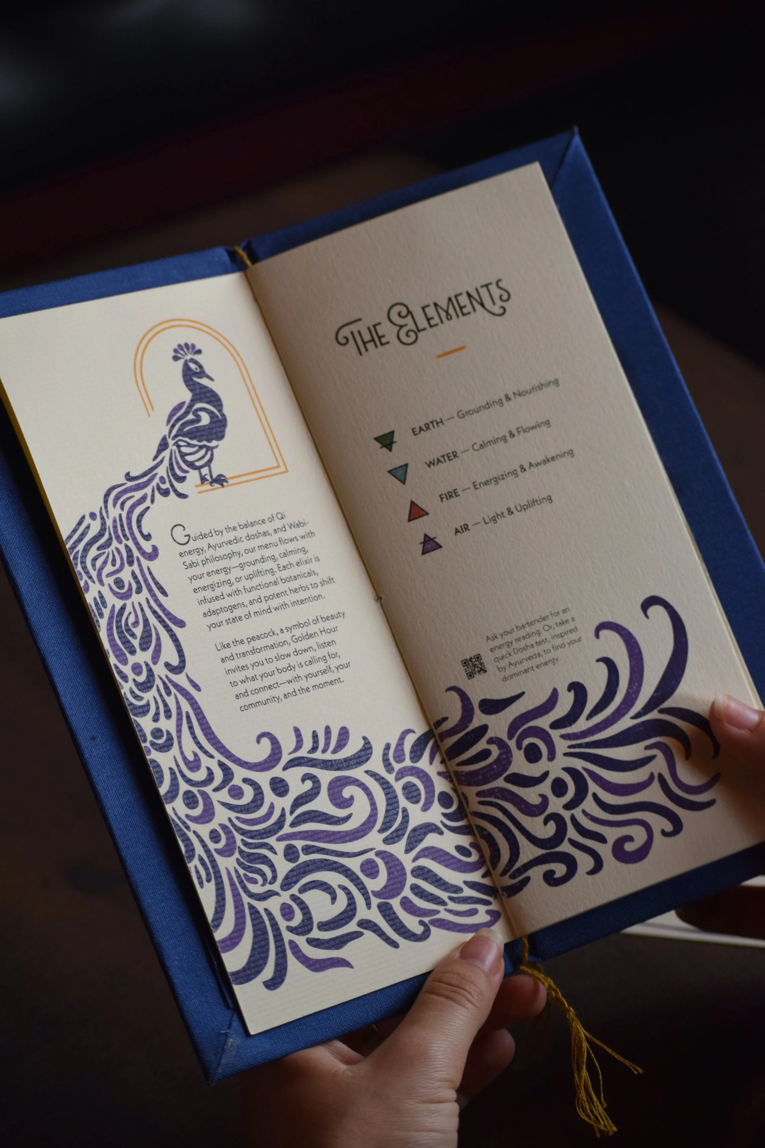
Golden Hour is a non-alcoholic speakeasy concept that reframes drinking as a mindful ritual. Botanically driven elixirs support distinct energetic states (grounding, calming, energizing, and uplifting) offering an intentional alternative to conventional nightlife. Inspired by Art Nouveau and anchored by the symbolism of the arch and peacock, the brand centers transformation, presence, and meaningful connection.
Solution
The project responds to the growing demand for sophisticated, non-alcoholic social spaces. The design elevates the menu beyond function, emphasizing ritual, atmosphere, and sensory detail through organic forms, rich color, tactile paper, and gold foil accents to evoke intimacy and quiet luxury. Eastern wellness philosophies inform the menu structure and naming system, creating an experience that feels intentional, elevated, and socially engaging.
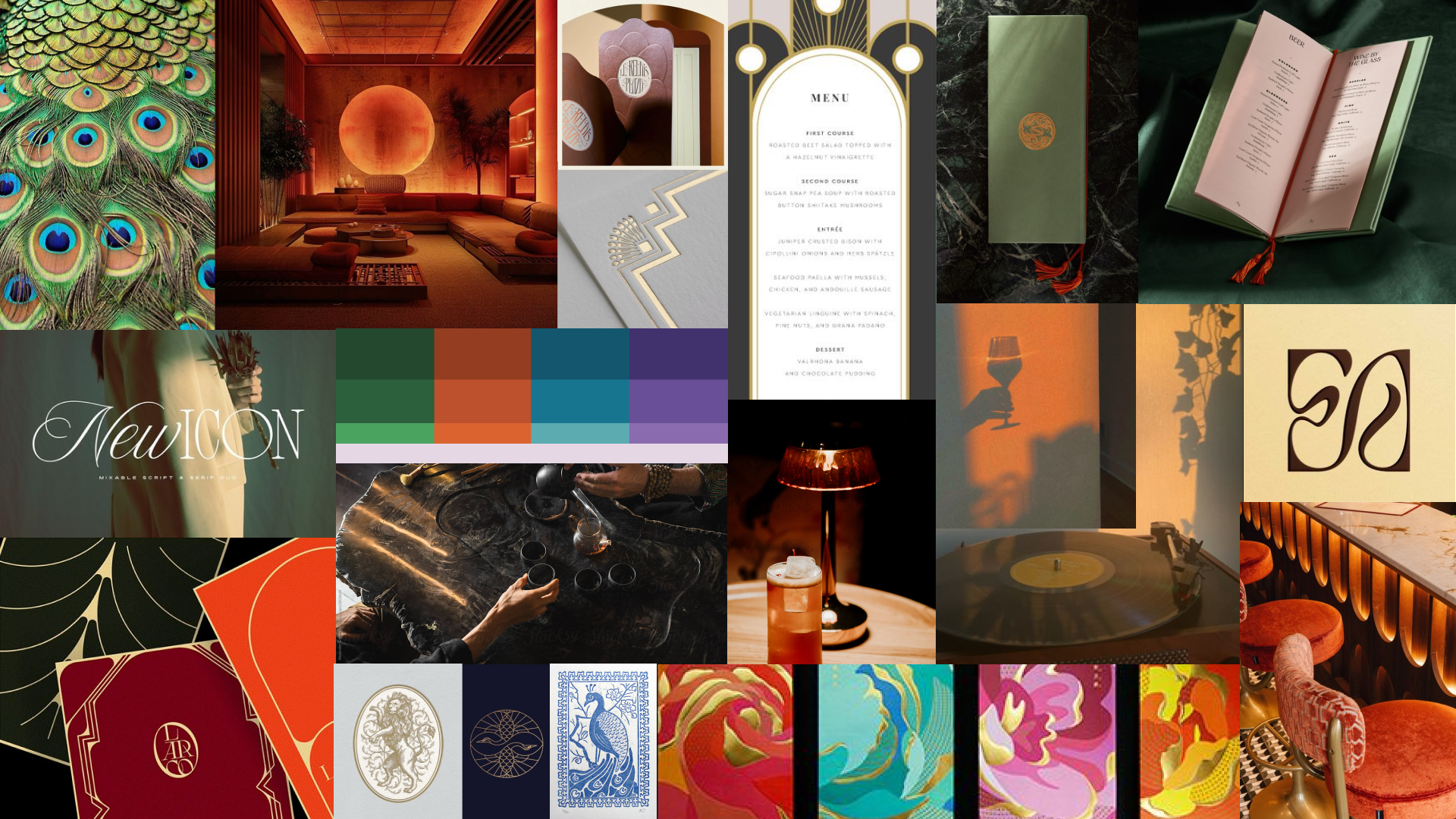
Moodboard
Work in Progress
I began by researching the cultural history of drinking rituals and the emerging shift toward intentional, non-alcoholic social spaces. I analyzed how atmosphere, symbolism, and menu structure influence behavior, then explored Art Nouveau as a visual system for its fluidity, ornamentation, and immersive qualities. From there, I synthesized Eastern wellness philosophies into an energy-based menu framework that guided both naming and hierarchy.
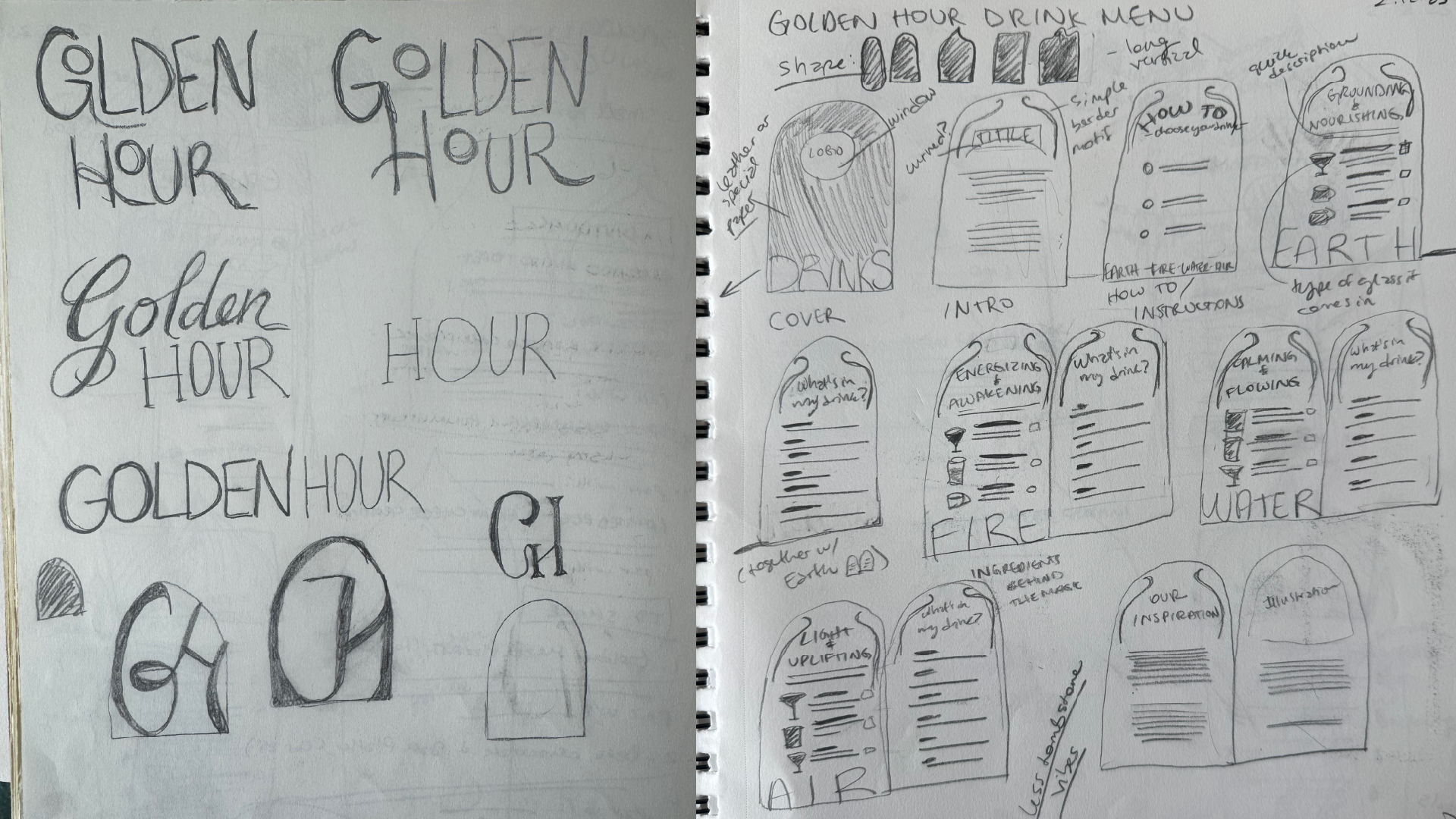
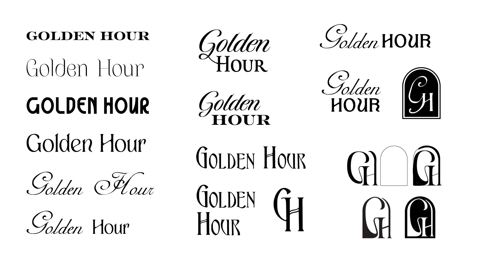
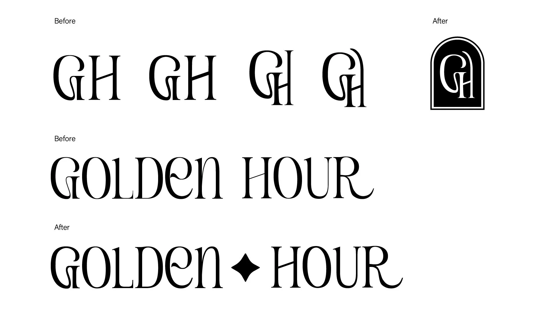
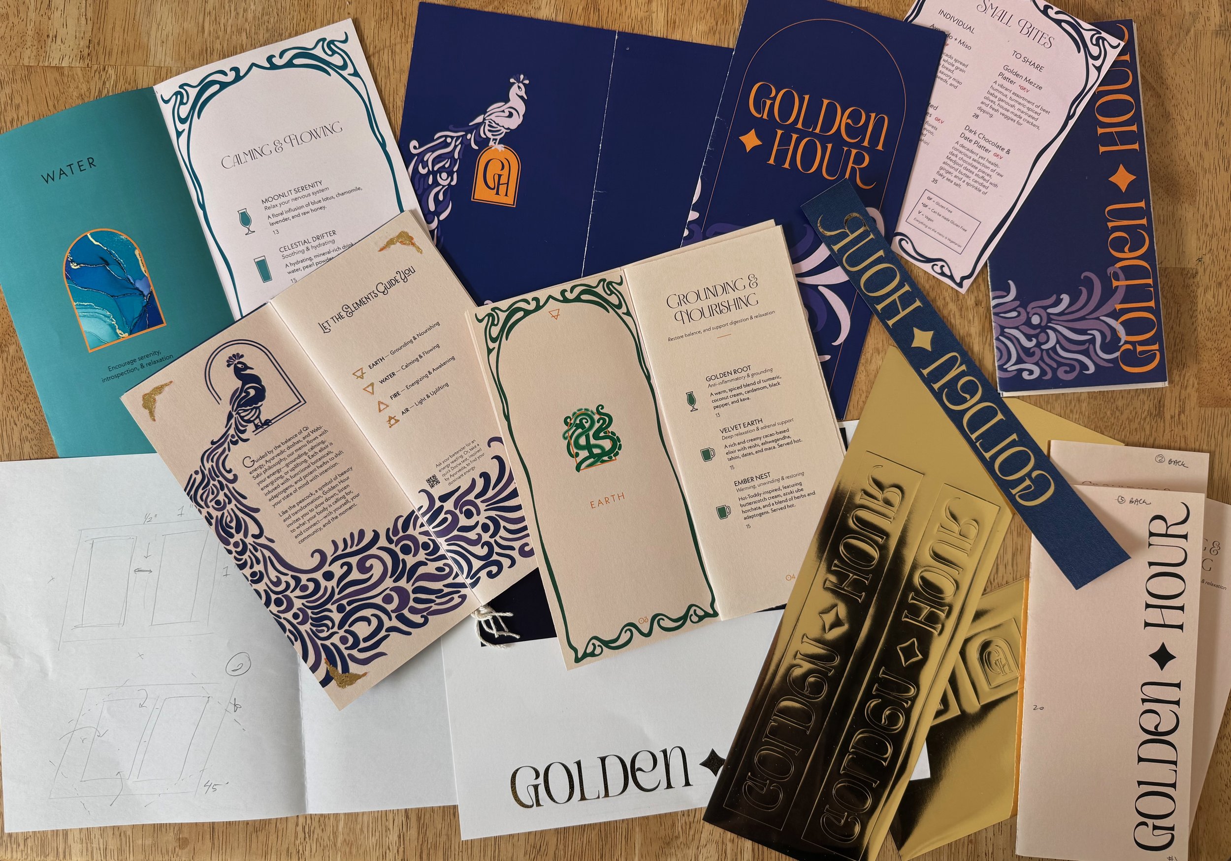
Symbolism was developed as a structural decoration method. The arch became a recurring motif to represent passage and transformation across cultures, while the peacock was introduced as a visual anchor to embody presence, renewal, and beauty in imperfection. Each layout decision (from typography to material finishes) was tested against the core question: Does this support ritual and intention?
Final Application
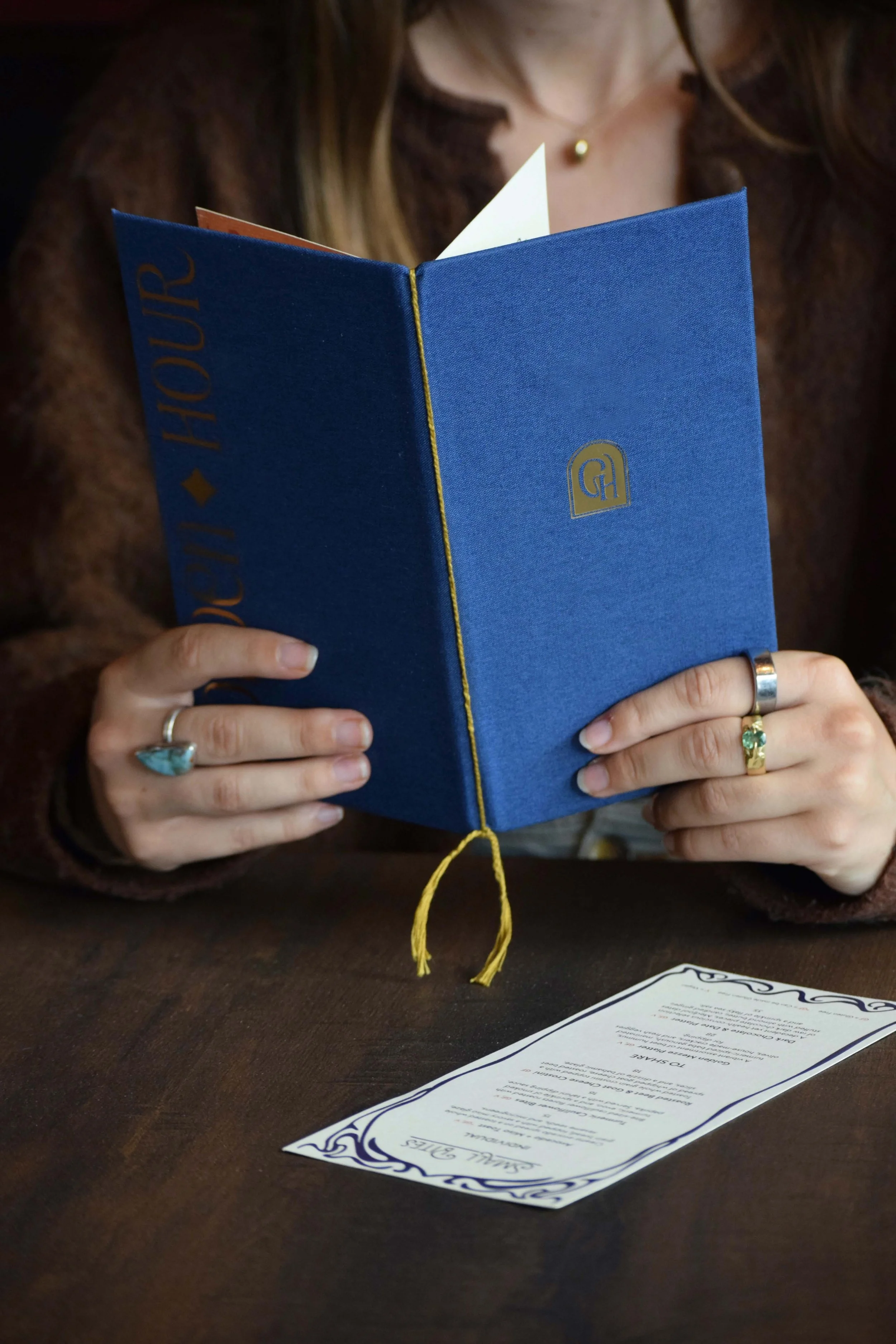
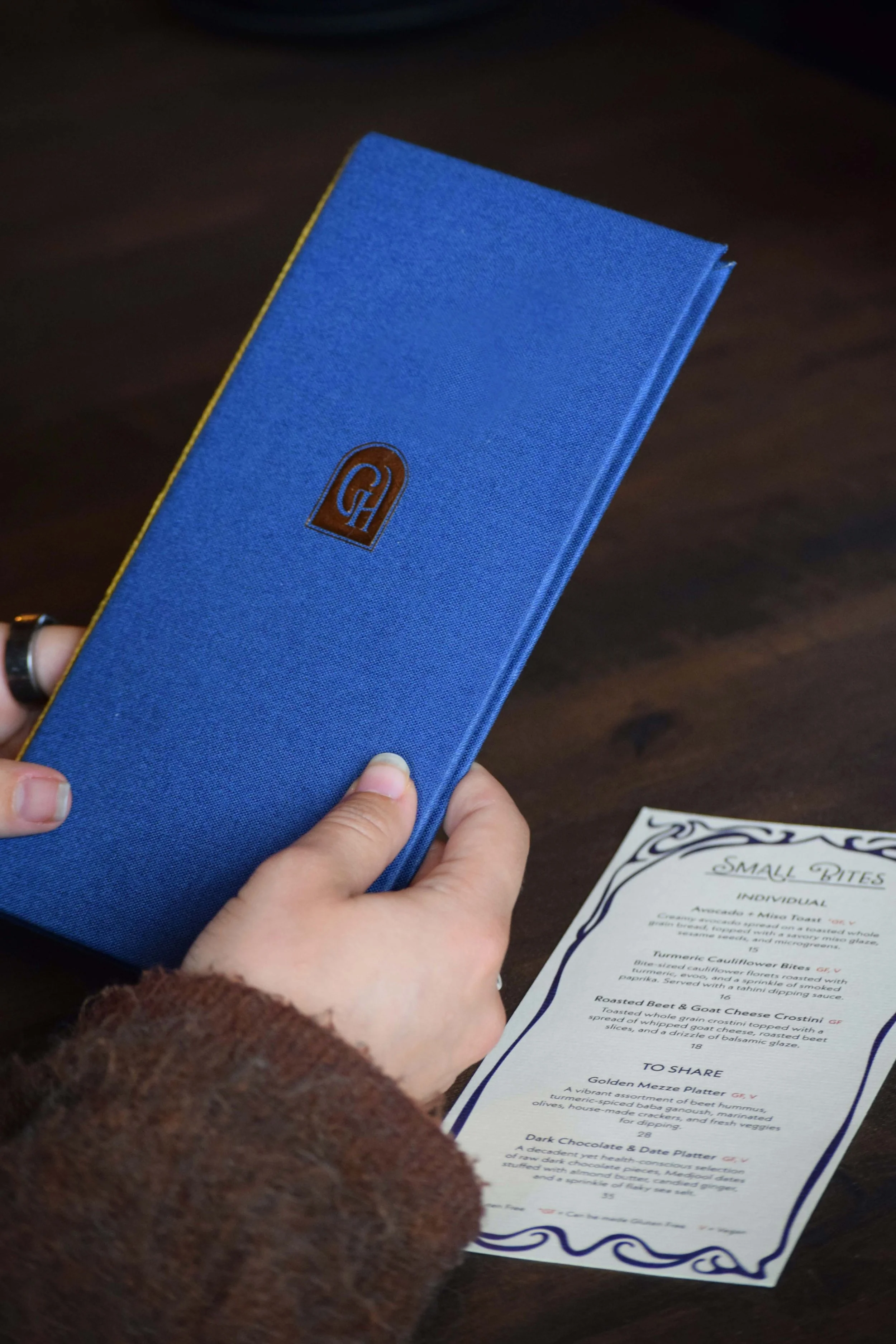
The drink menu was prototyped through several iterations to refine its size, typography, and color palette. I chose a simple saddle-stitch binding structure to keep the pages secure while allowing them to be easily rebound as the menu evolves. Inside the cover, the pages are bound with braided thread, creating a flexible system that allows the pages to be swapped without replacing the entire menu. To produce the cover, I learned to use a Silhouette machine to apply heat-transfer gold vinyl to the fabric. While I initially intended to incorporate gold foiling within the interior pages, production constraints led me to use a yellow-gold tone as a visual stand-in at this time.

Full Menu