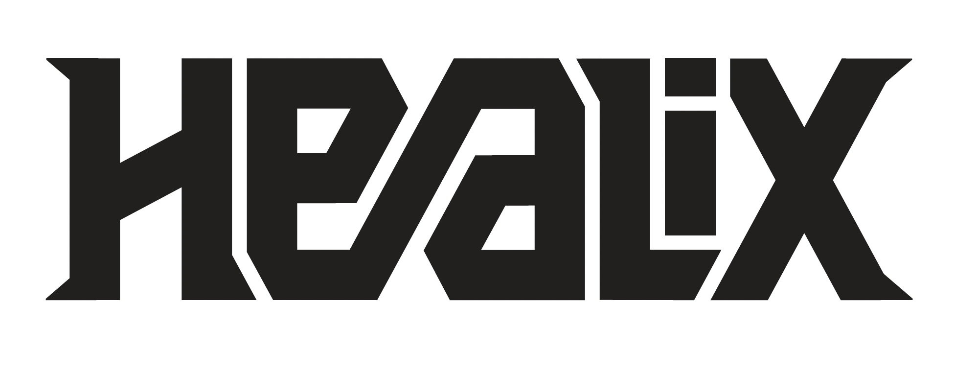
Healix
custom logo type • product placement • typographic label
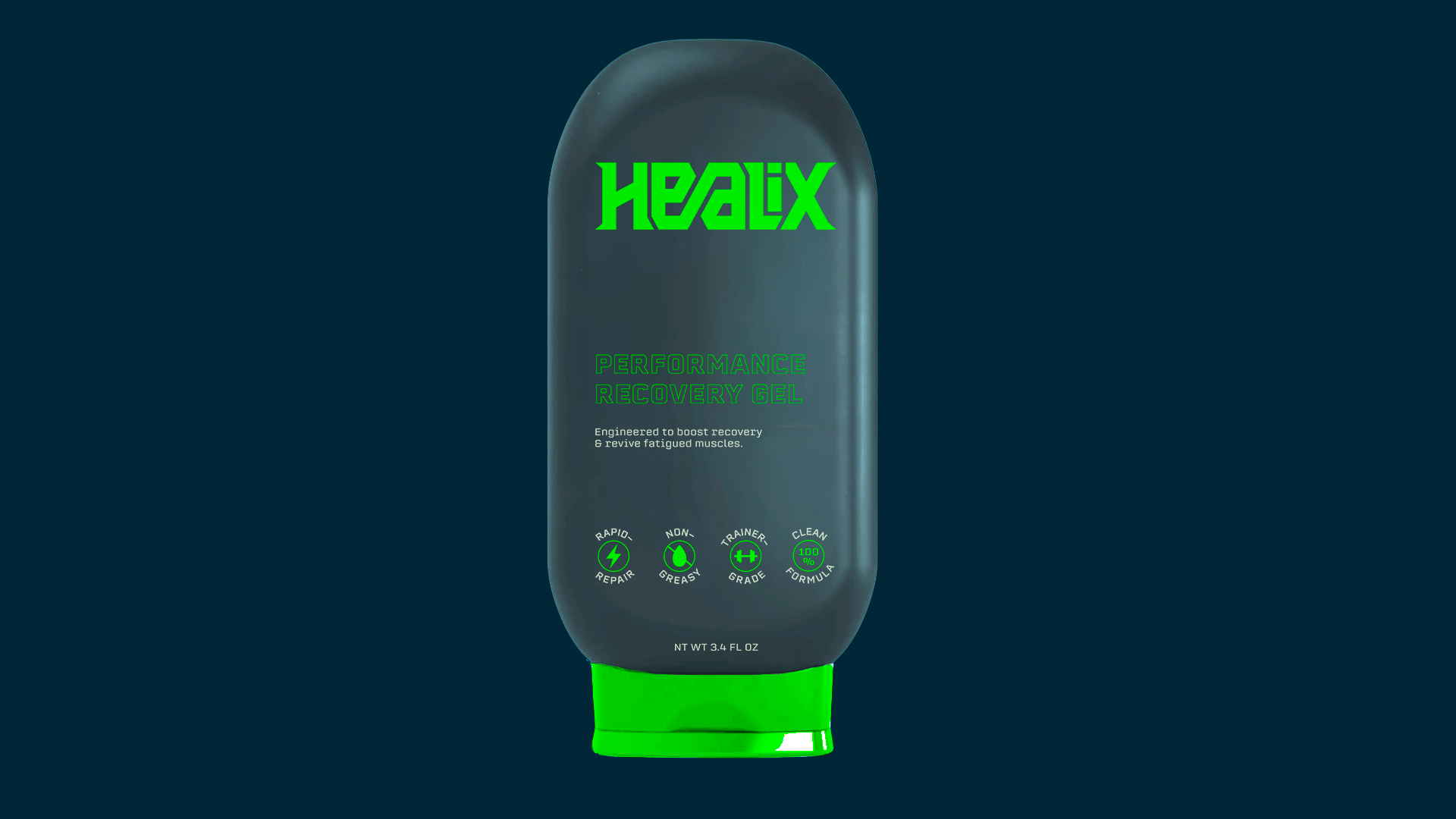
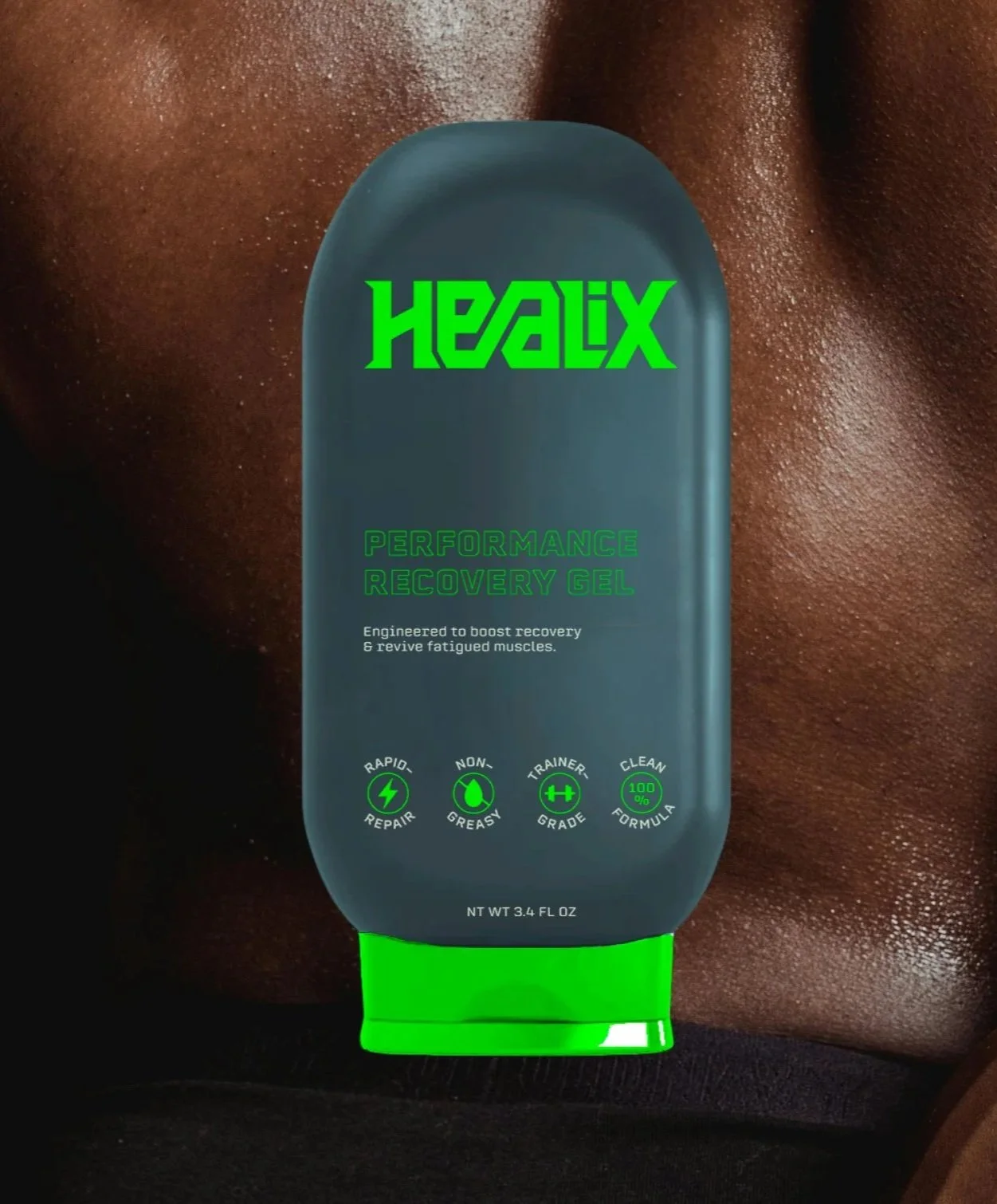
A clean, trainer-grade performance recovery gel designed to optimize output, not just relieve pain.
Completed
Fall 2025
Personality
Precise
Intentional
Strong
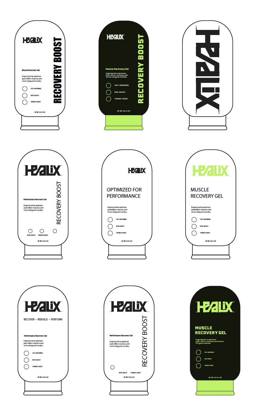
Brand Tool Kit
Erbaum

Objective
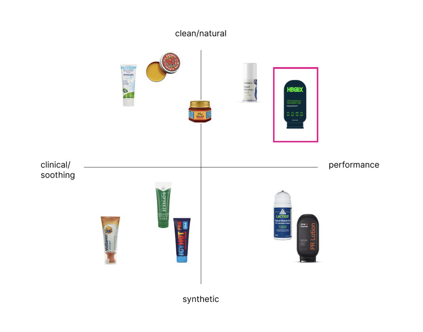
Healix was developed to fill a gap in the muscle recovery market: products are either clean and soothing, or clinical and performance-driven. The goal was to create a recovery gel that delivers professional-level results using cleaner, botanically enhanced ingredients, positioning recovery as performance optimization, not just relief.
Solution
Healix occupies the space between clinical and clean. The identity centers on a custom-designed logotype built with sharp, controlled geometry to communicate precision and strength. A high-contrast neon green against a dark matte base reinforces performance energy, while a restrained, structured layout emphasizes clarity and credibility.
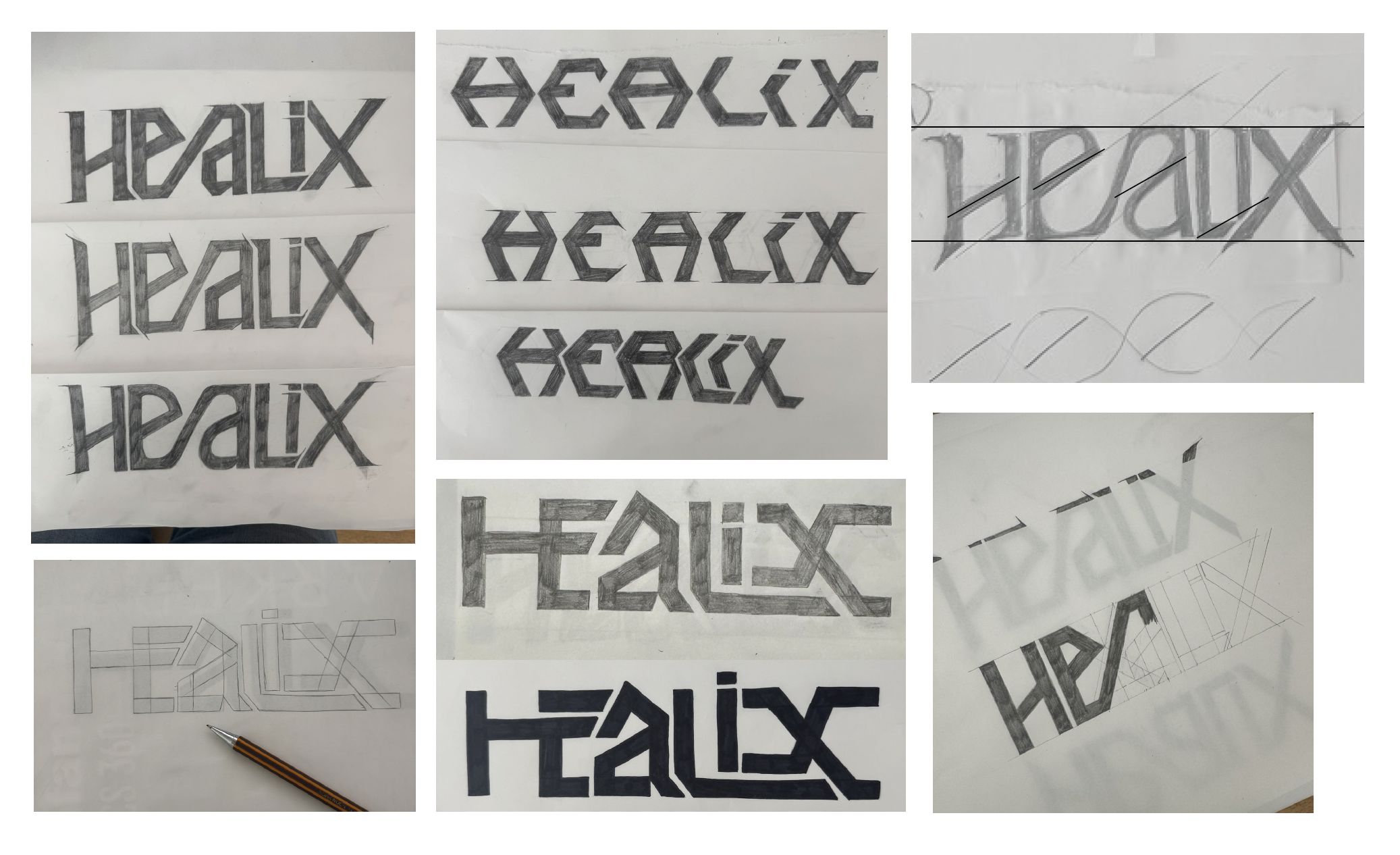
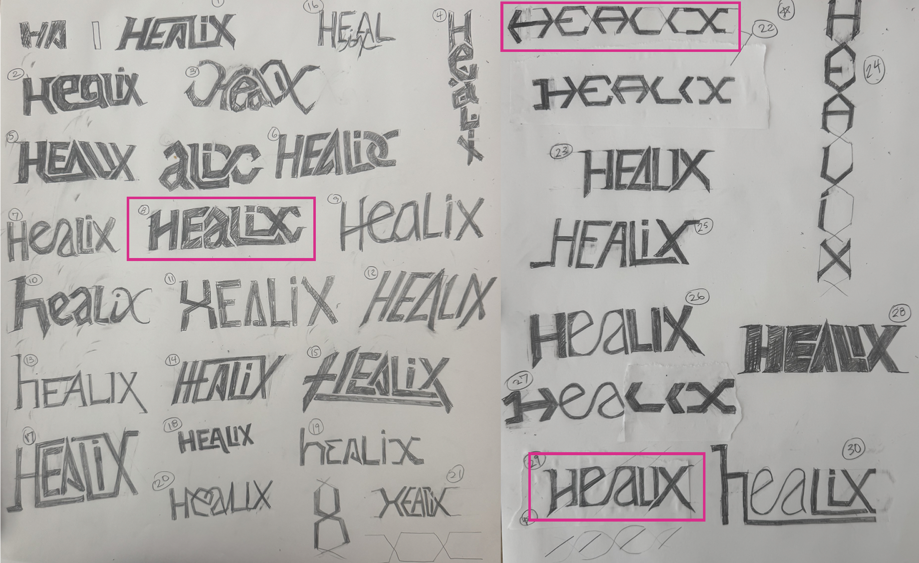
Work in Progress
Healix enters a new space between these extremes in a segment focused on performance, while still having clean ingredients. It treats recovery as part of output optimization rather than just relief. Designed for athletes, trainers, and physical therapists, anyone integrating recovery into performance routines.
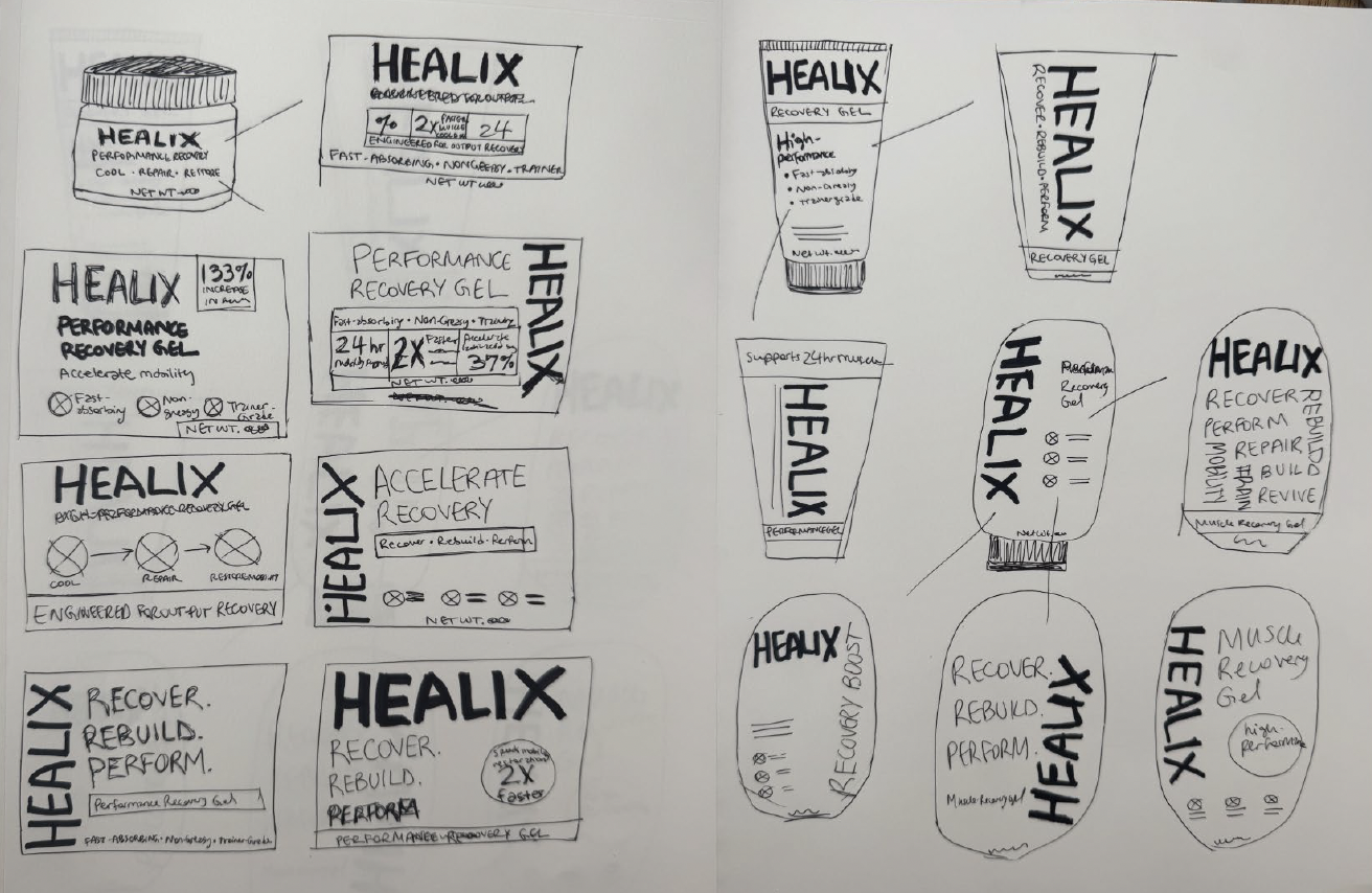
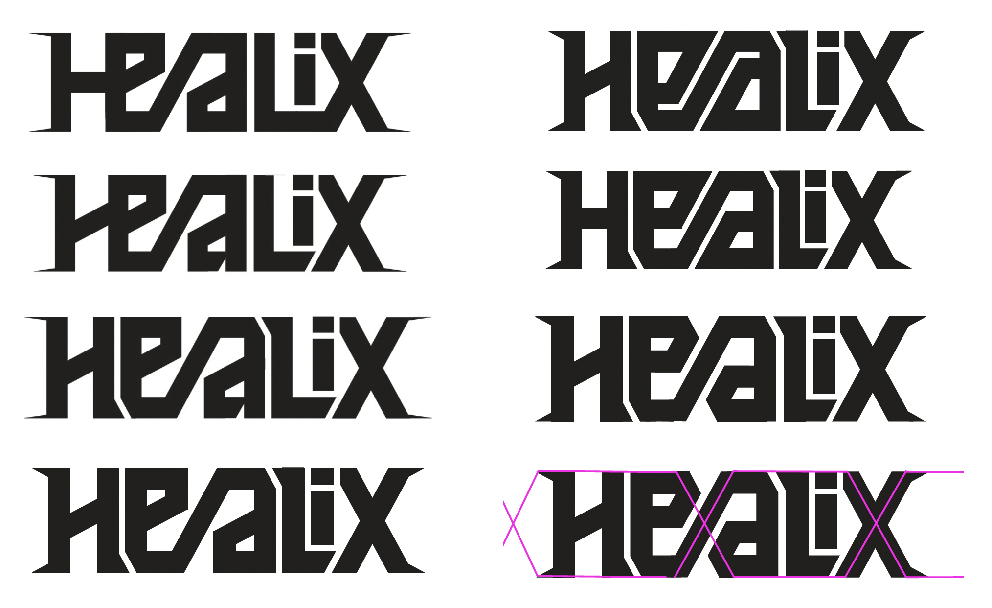
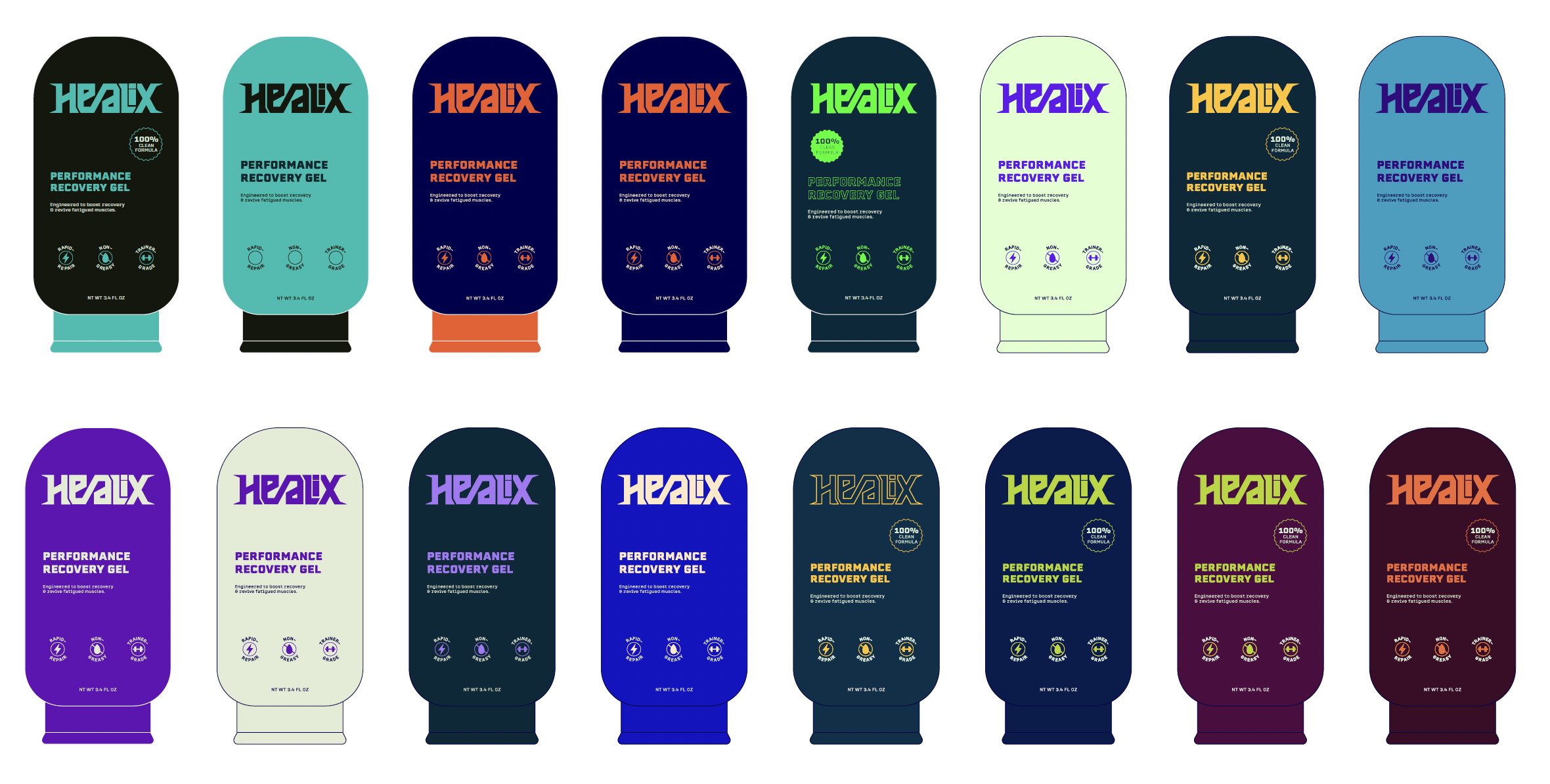
Final Application