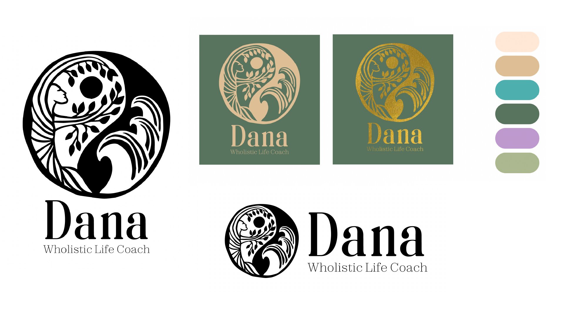
Dana
client work • website design • business cards • brand identity
A brand identity and landing page website for a holistic health practitioner.

Objective
Dana was launching a holistic life coaching practice and needed a cohesive brand presence that would establish credibility while reflecting the grounded, human-centered nature of her work. The goal was to create a visual identity and digital entry point that communicated clarity, warmth, and professionalism, helping potential clients quickly understand her approach to personal growth and feel comfortable taking the first step toward working with her.
Solution
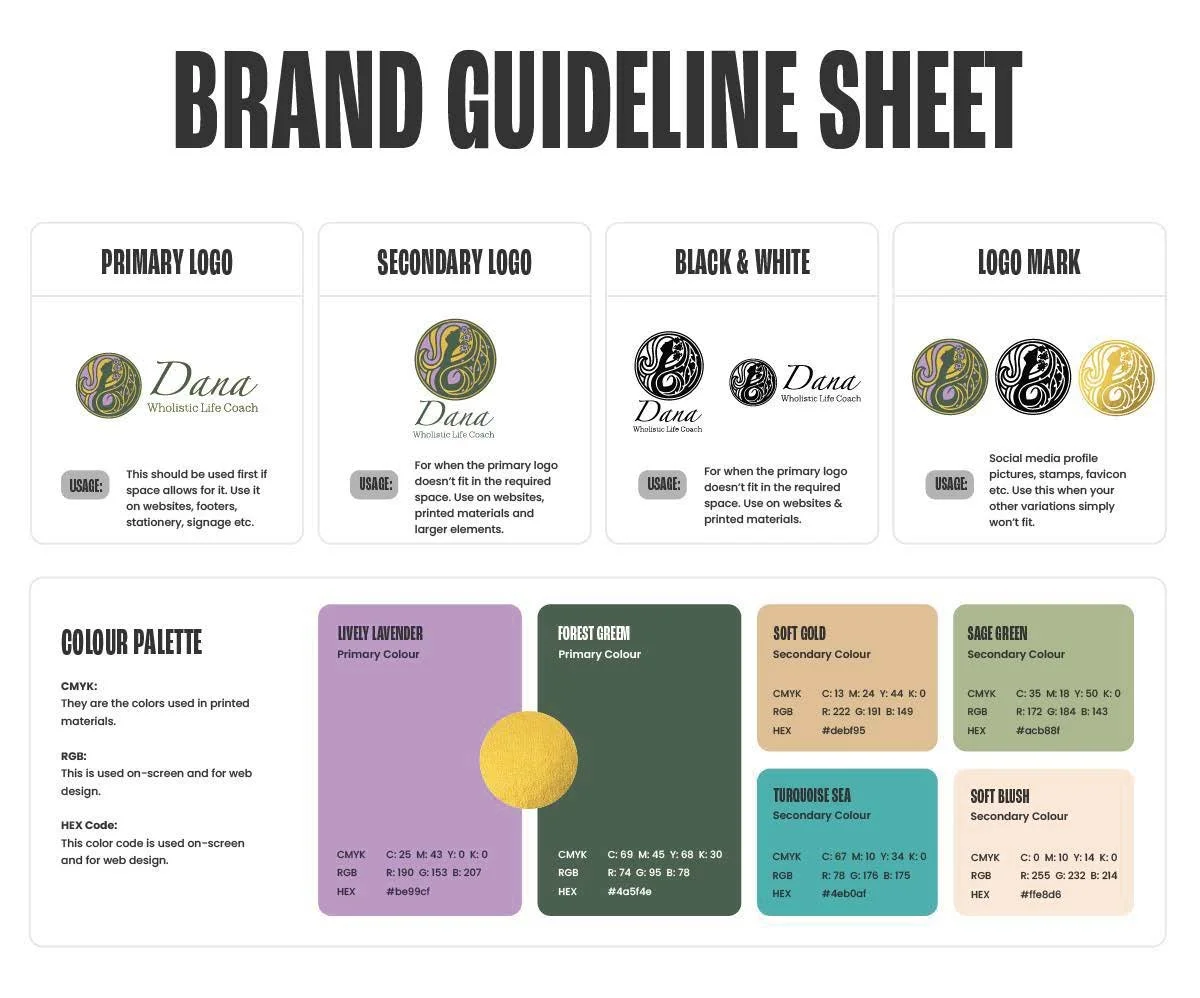
I developed a complete brand identity system, including logo design, typography, and color palette, designed to feel calm, approachable, and intentional. To support her launch, I designed and built a Squarespace landing page website that clearly communicates her coaching philosophy, services, and call to action, making it easy for visitors to learn about her offerings and get in touch. I also created a set of business cards to ensure her brand translated consistently into in-person networking and client interactions, providing Dana with a cohesive foundation as she began growing her practice.
Brand Identity & Moodboard
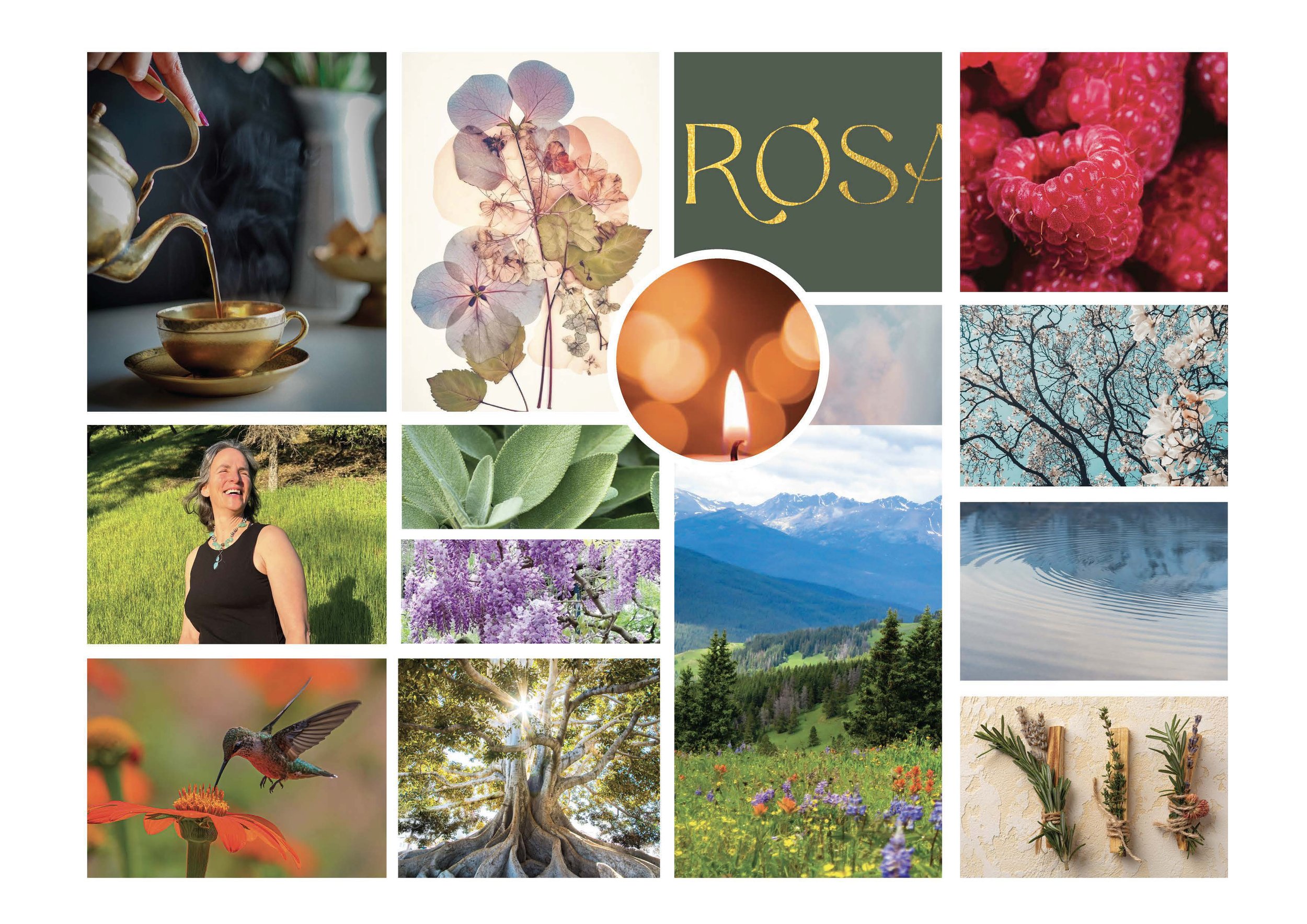
After sending her a detailed creative questionnaire, I had a series of meetings with Dana, beginning with a strategy meeting to address what she was looking for. She really wanted to be involved and was open to sharing feedback, so I worked with her to establish an identity she was happy with, while doing my best to adhere to best design practices.
Logo Design
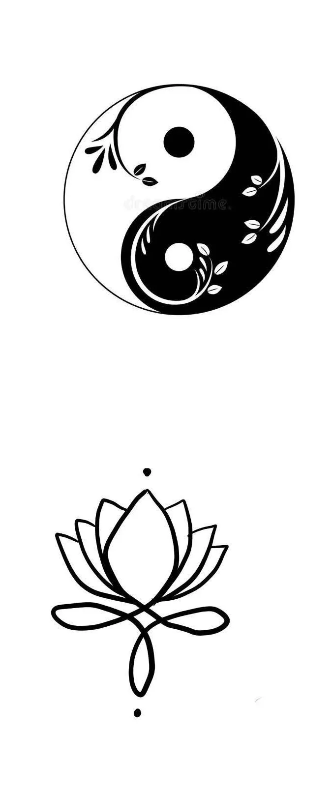
Dana gave me some inspiration images of a yin yang and lotus symbol and emphasized the importance of having her logo be linked to nature.
Inspiration images
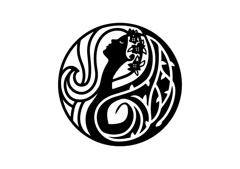
After a couple of rounds of feedback, Dana resonated with the yin-yang concept, so I provided her with three different directions. She wanted to highlight femininity, warmth, and nature in her personal brand. On separate slides, I presented each concept, introducing the color palette to see it in application.

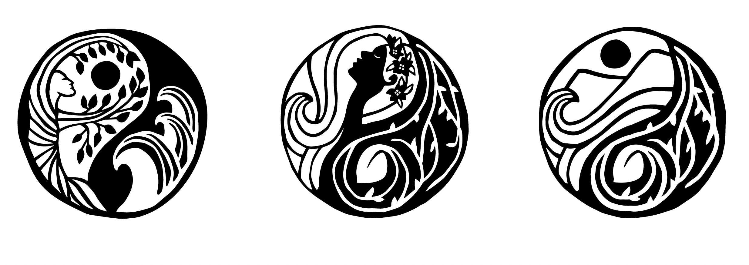
Sketches
Final Application
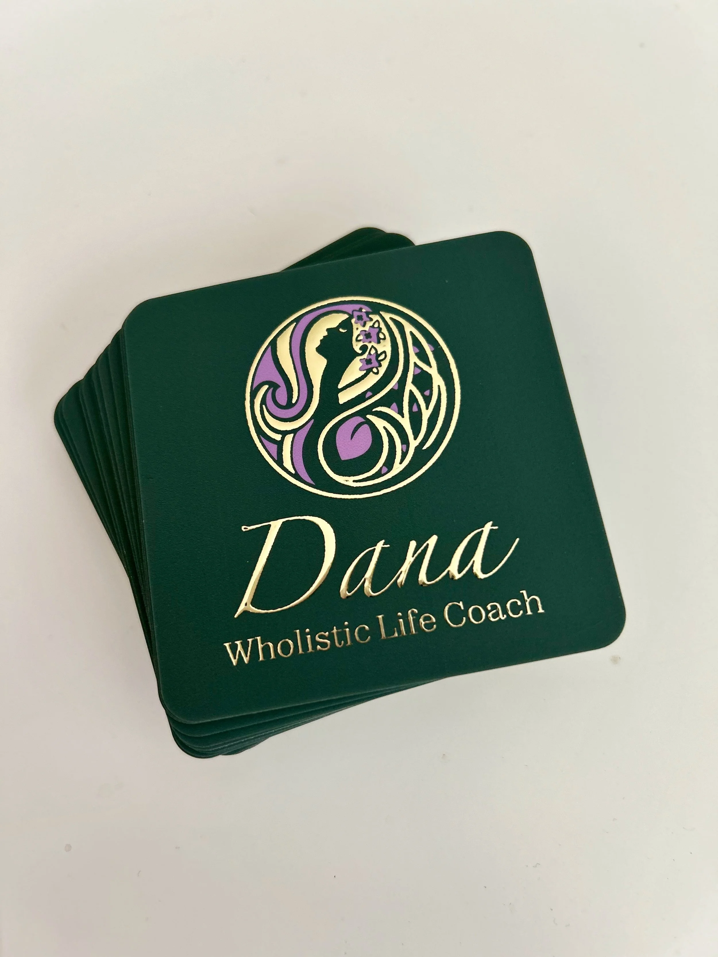
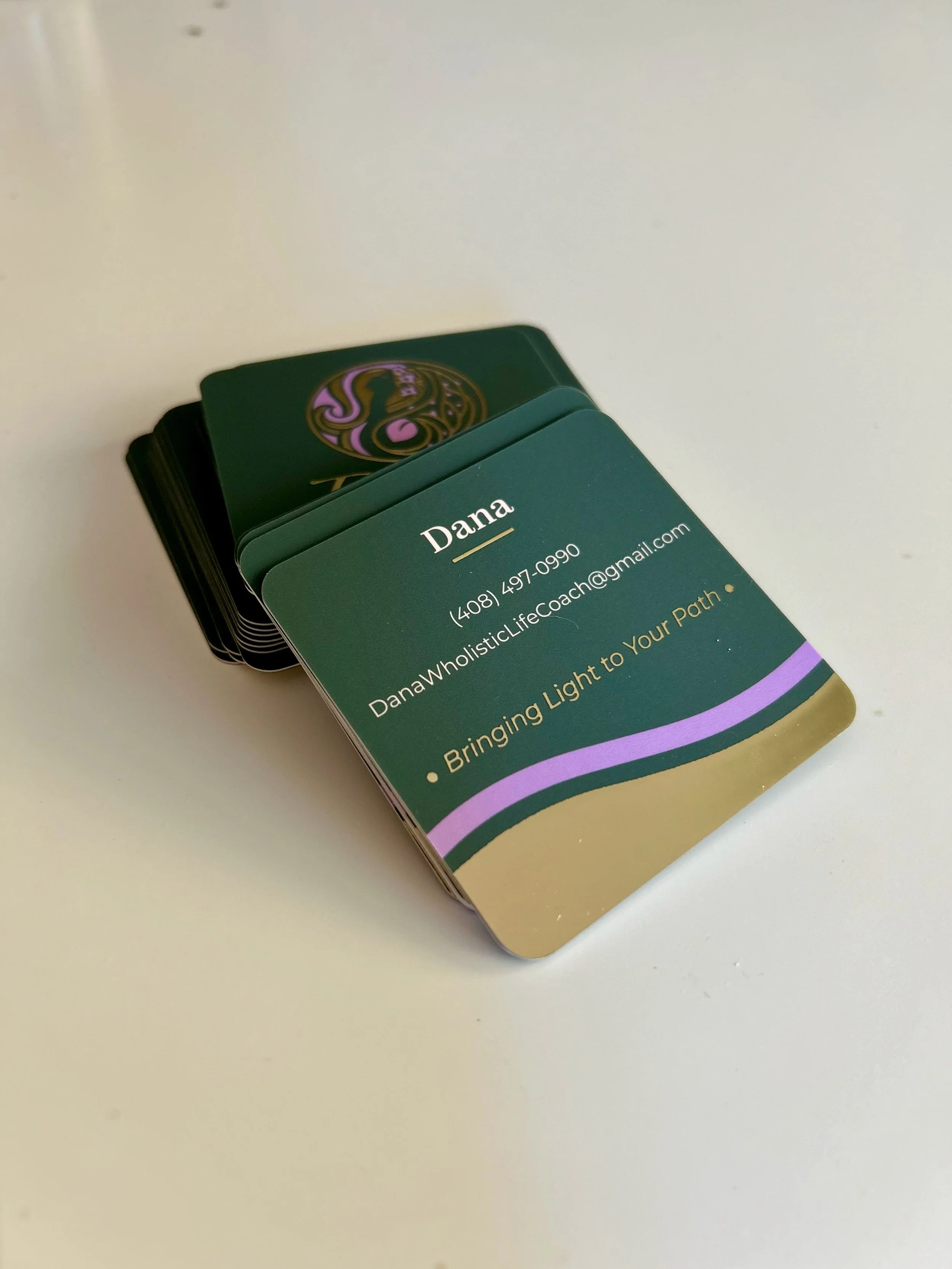
I recommended Dana a business card service that sent free samples of each material they printed with. She chose a soft matte finish and wanted a square shape. Then, I walked her through how to set up the specific print files in the business card service we used to ensure a successful application of the gold foil.
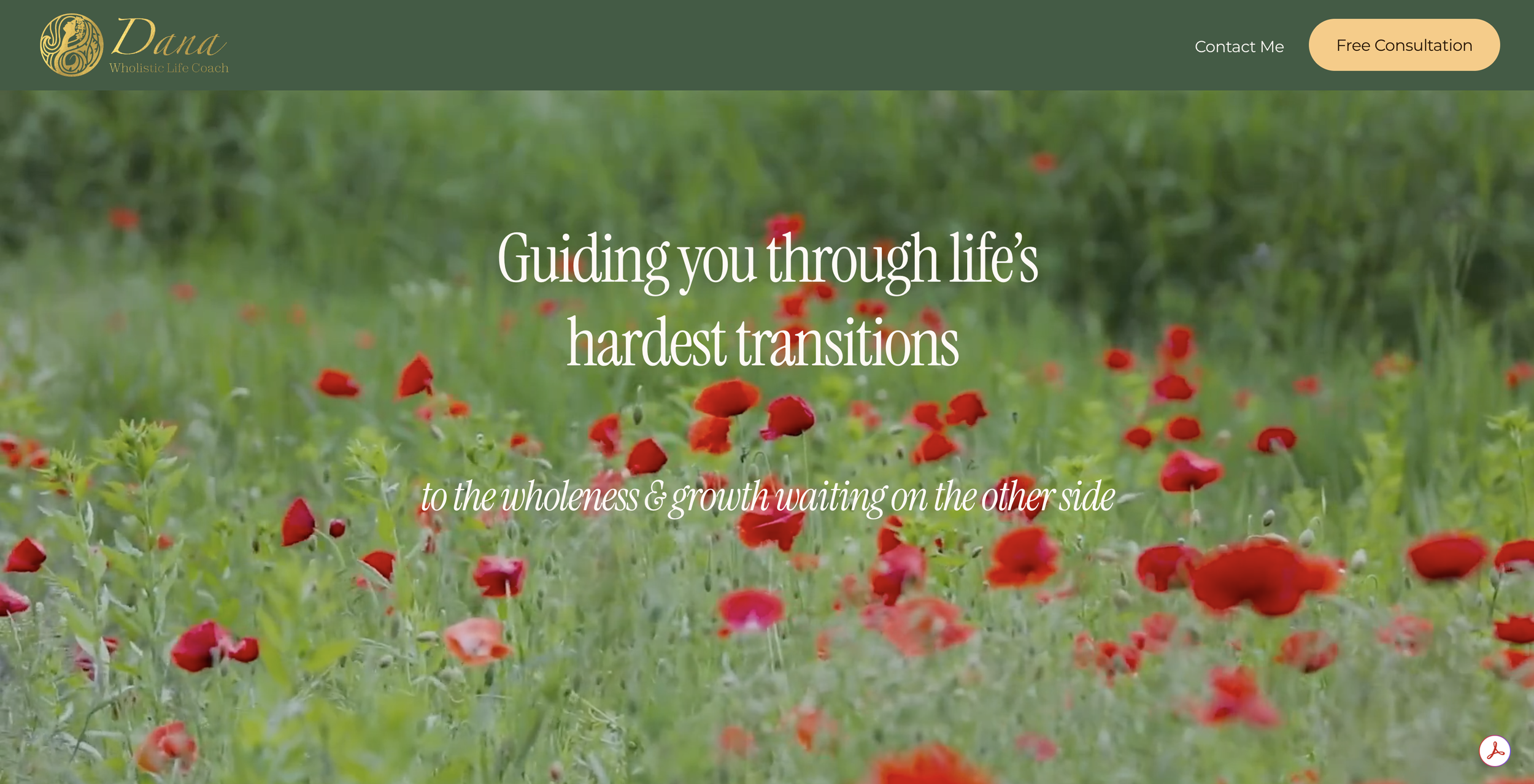
Website Landing Page
She provided me with the website copy, and I applied thoughtful use of her brand color palette to keep it simple, refined, and approachable. I designed a one-page landing page that clearly communicates her coaching philosophy, services, and call to action, making it easy for visitors to learn about her offerings and get in touch.